270 Cross Platforms Icons
A unified icon system for a real estate product — 270 UI icons plus a complete catalog taxonomy, rebuilt on a 24×24 grid with a consistent 2px stroke and adapted for six platform contexts.
270
icons & nodes
6
platform contexts
1 click
recolor
24x24
grid
2px
stroke
About project
Platform: Web + iOS + macOS + Android
My role: Product Designer
(icon system owner, end to end)
Team: product manager + developers
Timeline: 2 months
Method: audit → system rules → platform adaptation
My role: Product Designer
(icon system owner, end to end)
Team: product manager + developers
Timeline: 2 months
Method: audit → system rules → platform adaptation
Platform: Web + Mobile

Six platforms. One source of truth.
A giant coverage matrix – every entity × every platform. It exposed duplicates, gaps and mismatched metaphors, then became the project's tracking tool.


Built on rules
24×24 grid, 2px rounded stroke, optically balanced. Any new icon automatically looks like part of the system.

Fill, not stroke
Every icon is flattened into a solid shape: strokes are outlined into fills. Developers recolor it with a single fill property – no stroke settings to manage, no scaling artifacts, easy theming and states

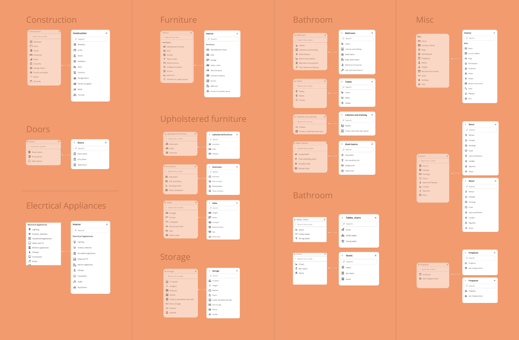
The catalog, untangled.
A legacy of mixed-style category panels became a clean taxonomy – Construction, Furniture, Appliances, Misc with a consistent line icon for every level.